## Data Import and handling
library(MsExperiment)
library(MsIO)
library(MsBackendMetaboLights)
library(SummarizedExperiment)

## Preprocessing of LC-MS data
library(xcms)
library(Spectra)
library(MetaboCoreUtils)
library(Biobase)

## Visualisation
library(pander)
library(RColorBrewer)
library(pheatmap)Dataset investigation: What to do when you get your data
2026-07-17
Source:vignettes/dataset-investigation.qmd
Introduction
So, you (or your amazing lab mate) have finally finished the data acquisition, and now you have a dataset in hand. What’s next? Unfortunately, the work isn’t over yet. Before diving into any analysis, it’s crucial to understand the dataset itself. This is the first step in any data analysis workflow, ensuring that the data is of good quality and is well-prepared for preprocessing and any downstream analysis you plan to perform.
In this vignette, we present the dataset used throughout the different vignettes of this website. It’s far from a perfect dataset, which actually mirrors the reality of most datasets you’ll encounter in research.
Some issues will indeed be specific to this described dataset. However, the purpose of this vignette is to encourage you to think critically about your data and guide you through steps that can help you avoid spending hours on an analysis, only to realize later that some samples or features should have been removed or flagged earlier on.
Dataset Description
In this workflow, two datasets are used:
- An LC-MS-based (MS1 level only) untargeted metabolomics dataset to quantify small polar metabolites in human plasma samples.
- An additional LC-MS/MS dataset of selected samples from the former study for the identification and annotation of significant features.
The samples were randomly selected from a larger study aimed at identifying metabolites with varying abundances between individuals suffering from cardiovascular disease (CVD) and healthy controls (CTR). The subset analyzed here includes data for three CVD patients, three CTR individuals, and four quality control (QC) samples. The QC samples, representing a pooled serum sample from a large cohort, were measured repeatedly throughout the experiment to monitor signal stability.
The data and metadata for this workflow are available on the MetaboLights database under the ID: MTBLS8735.
The detailed materials and methods used for the sample analysis are also available in the MetaboLights entry. This is particularly important for understanding the analysis and the parameters used. It should be noted that the samples were analyzed using ultra-high-performance liquid chromatography (UHPLC) coupled to a Q-TOF mass spectrometer (TripleTOF 5600+), and chromatographic separation was achieved using hydrophilic interaction liquid chromatography (HILIC).
- Provide more in-depth visualizations to explore and understand the dataset quality.
- Compare pool lc-ms and pool lc-ms/ms and show that we have better separation on the second run.
Package
MS1 level data
We first load the raw data from MetaboLights:
param <- MetaboLightsParam(mtblsId = "MTBLS8735",
                           assayName = paste0("a_MTBLS8735_LC-MS_positive_",
                                              "hilic_metabolite_profiling.txt"),
                           filePattern = ".mzML")

lcms1 <- readMsObject(MsExperiment(),
                      param,
                      keepOntology = FALSE,
                      keepProtocol = FALSE,
                      simplify = TRUE)
We set up parallel processing to facilitate futher computations.
#' Set up parallel processing using 2 cores
if (.Platform$OS.type == "unix") {
    register(MulticoreParam(2))
} else {
    register(SnowParam(2))
}
We update the metadata to make the column names easier to access:
# Let's rename the column for easier access
colnames(sampleData(lcms1)) <- c("sample_name", "derived_spectra_data_file",
                                "metabolite_asssignment_file",
                                "source_name",
                                "organism",
                                "blood_sample_type",
                                "sample_type", "age", "unit", "phenotype")

# Add "QC" to the phenotype of the QC samples
qc_idx <- sampleData(lcms1)$sample_name == "POOL"
sampleData(lcms1)$phenotype[qc_idx] <- "QC"
sampleData(lcms1)$sample_name[qc_idx] <- c("POOL1", "POOL2", "POOL3", "POOL4")

#  Add injection index column
sampleData(lcms1)$injection_index <- seq_len(nrow(sampleData(lcms1)))

#let's look at the updated sample data
sampleData(lcms1)[, c("derived_spectra_data_file",
                     "phenotype", "sample_name", "age",
                     "injection_index")] |>
kable(format = "pipe")| derived_spectra_data_file | phenotype | sample_name | age | injection_index |
|---|---|---|---|---|
| FILES/MS_QC_POOL_1_POS.mzML | QC | POOL1 | NA | 1 |
| FILES/MS_A_POS.mzML | CVD | A | 53 | 2 |
| FILES/MS_B_POS.mzML | CTR | B | 30 | 3 |
| FILES/MS_QC_POOL_2_POS.mzML | QC | POOL2 | NA | 4 |
| FILES/MS_C_POS.mzML | CTR | C | 66 | 5 |
| FILES/MS_D_POS.mzML | CVD | D | 36 | 6 |
| FILES/MS_QC_POOL_3_POS.mzML | QC | POOL3 | NA | 7 |
| FILES/MS_E_POS.mzML | CTR | E | 66 | 8 |
| FILES/MS_F_POS.mzML | CVD | F | 44 | 9 |
| FILES/MS_QC_POOL_4_POS.mzML | QC | POOL4 | NA | 10 |
#' Define colors for the different phenotypes
col_phenotype <- brewer.pal(9, name = "Set1")[c(9, 5, 4)]
names(col_phenotype) <- c("QC", # grey
                          "CVD", # orange
                          "CTR") # purple
col_sample <- col_phenotype[sampleData(lcms1)$phenotype]
Spectra exploration
Quick reminder that we access the spectra data as below:
#' Access Spectra Object
spectra(lcms1)
MSn data (Spectra) with 17210 spectra in a MsBackendMetaboLights backend:
msLevel rtime scanIndex
<integer> <numeric> <integer>
1 1 0.274 1
2 1 0.553 2
3 1 0.832 3
4 1 1.111 4
5 1 1.390 5
... ... ... ...
17206 1 479.052 1717
17207 1 479.331 1718
17208 1 479.610 1719
17209 1 479.889 1720
17210 1 480.168 1721
... 37 more variables/columns.
file(s):
MS_QC_POOL_1_POS.mzML
MS_A_POS.mzML
MS_B_POS.mzML
... 7 more filesOne of the first check that should be done is evaluatating the number of spectra per sample. Below we summarize the number of spectra and their respective MS level (extracted with the msLevel() function). The fromFile() function returns for each spectrum the index of its sample (data file) and can thus be used to split the information (MS level in this case) by sample to further summarize using the base R table() function and combine the result into a matrix.
#' Count the number of spectra with a specific MS level per file.
spectra(lcms1) |>
    msLevel() |>
    split(fromFile(lcms1)) |>
    lapply(table) |>
    do.call(what = cbind)
1 2 3 4 5 6 7 8 9 10
1 1721 1721 1721 1721 1721 1721 1721 1721 1721 1721The present data set thus contains only MS1 data, which is ideal for quantification of the signal. A second (LC-MS/MS) data set also with fragment (MS2) spectra of the same samples will be used later on in the workflow. We also cannot see any large difference in number of spectra between the samples, which is a good sign that the data is of good quality. If one sample had a significantly lower number of spectra, it would be a sign of a potential issue with the sample.
Data obtained from LC-MS experiments are typically analyzed along the retention time axis, while MS data is organized by spectrum, orthogonal to the retention time axis. As another example, we below determine the retention time range for the entire data set.
Data visualization and general quality assessment
Effective visualization is paramount for inspecting and assessing the quality of MS data. For a general overview of our LC-MS data, we can:
- Combine all mass peaks from all (MS1) spectra of a sample into a single spectrum in which each mass peak then represents the maximum signal of all mass peaks with a similar m/z. This spectrum might then be called Base Peak Spectrum (BPS), providing information on the most abundant ions of a sample.
- Aggregate mass peak intensities for each spectrum, resulting in the Base Peak Chromatogram (BPC). The BPC shows the highest measured intensity for each distinct retention time (hence spectrum) and is thus orthogonal to the BPS.
- Sum the mass peak intensities for each spectrum to create a Total Ion Chromatogram (TIC).
- Compare the BPS of all samples in an experiment to evaluate similarity of their ion content.
- Compare the BPC of all samples in an experiment to identify samples with similar or dissimilar chromatographic signal.
In addition to such general data evaluation and visualization, it is also crucial to investigate specific signal of e.g. internal standards or compounds/ions known to be present in the samples. By providing a reliable reference, internal standards help achieve consistent and accurate analytical results.
Spectra Data Visualization: BPS
The BPS collapses data in the retention time dimension and reveals the most prevalent ions present in each of the samples, creation of such BPS is however not straightforward. Mass peaks, even if representing signals from the same ion, will never have identical m/z values in consecutive spectra due to the measurement error/resolution of the instrument.
Below we use the combineSpectra function to combine all spectra from one file (defined using parameter f = fromFile(data)) into a single spectrum. All mass peaks with a difference in m/z value smaller than 3 parts-per-million (ppm) are combined into one mass peak, with an intensity representing the maximum of all such grouped mass peaks. To reduce memory requirement, we in addition first bin each spectrum combining all mass peaks within a spectrum, aggregating mass peaks into bins with 0.01 m/z width. In case of large datasets, it is also recommended to set the processingChunkSize() parameter of the MsExperiment object to a finite value (default is Inf) causing the data to be processed (and loaded into memory) in chunks of processingChunkSize() spectra. This can reduce memory demand and speed up the process.
#' Setting the chunksize
chunksize <- 1000
processingChunkSize(spectra(lcms1)) <- chunksize
We can now generate BPS for each sample and plot() them.
#' Combining all spectra per file into a single spectrum
bps <- spectra(lcms1) |>
    bin(binSize = 0.01) |>
    combineSpectra(f = fromFile(lcms1), intensityFun = max, ppm = 3)

#' Plot the base peak spectra
par(mar = c(2, 1, 1, 1))
plotSpectra(bps, main= "")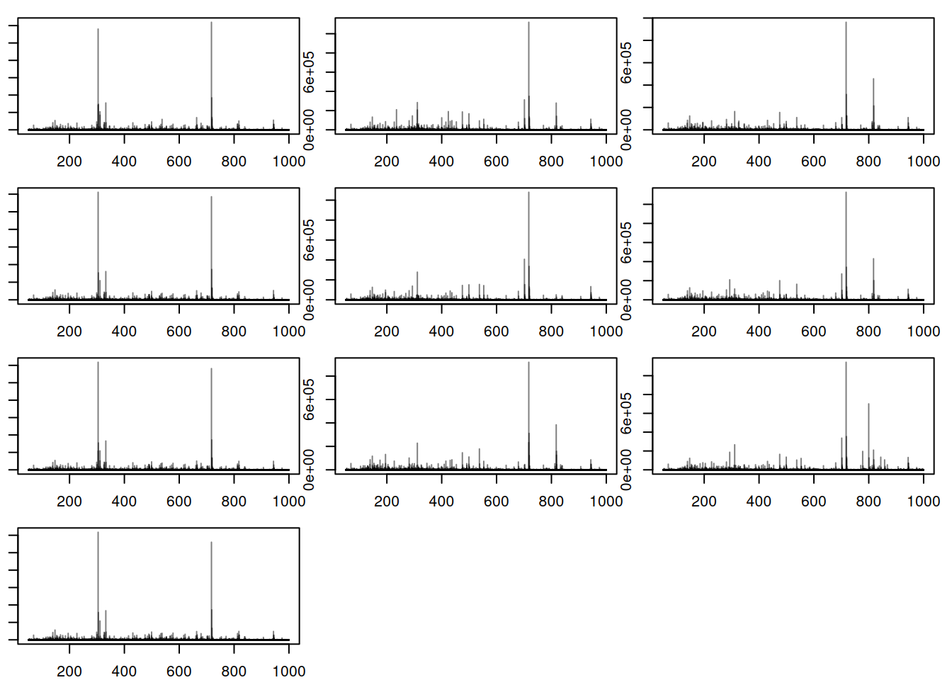
Here, there is observable overlap in ion content between the files, particularly around 300 m/z and 700 m/z. There are however also differences between sets of samples. In particular, BPS 1, 4, 7 and 10 (counting row-wise from left to right) seem different than the others. In fact, these four BPS are from QC samples, and the remaining six from the study samples. The observed differences might be explained by the fact that the QC samples are pools of serum samples from a different cohort, while the study samples represent plasma samples, from a different sample collection.
Next to the visual inspection above, we can also calculate and express the similarity between the BPS with a heatmap. Below we use the compareSpectra() function to calculate pairwise similarities between all BPS and use then the pheatmap() function from the pheatmap package to cluster and visualize this result.
#' Calculate similarities between BPS
sim_matrix <- compareSpectra(bps)

#' Add sample names as rownames and colnames
rownames(sim_matrix) <- colnames(sim_matrix) <- sampleData(lcms1)$sample_name
ann <- data.frame(phenotype = sampleData(lcms1)[, "phenotype"])
rownames(ann) <- rownames(sim_matrix)

#' Plot the heatmap
pheatmap(sim_matrix, annotation_col = ann,
         annotation_colors = list(phenotype = col_phenotype))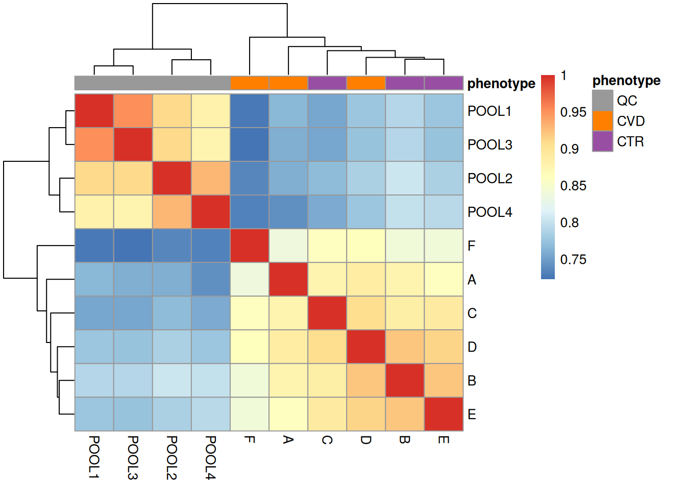
We get a first glance at how our different samples distribute in terms of similarity. The heatmap confirms the observations made with the BPS, showing distinct clusters for the QCs and the study samples, owing to the different matrices and sample collections.
It is also strongly recommended to delve deeper into the data by exploring it in more detail. This can be accomplished by carefully assessing our data and extracting spectra or regions of interest for further examination. In the next chunk, we will look at how to extract information for a specific spectrum from distinct samples.
#' Accessing a single spectrum - comparing with QC
par(mfrow = c(1,2), mar = c(2, 2, 2, 2))
spec1 <- spectra(lcms1[1])[125]
spec2 <- spectra(lcms1[3])[125]
plotSpectra(spec1, main = "QC sample")
plotSpectra(spec2, main = "CTR sample")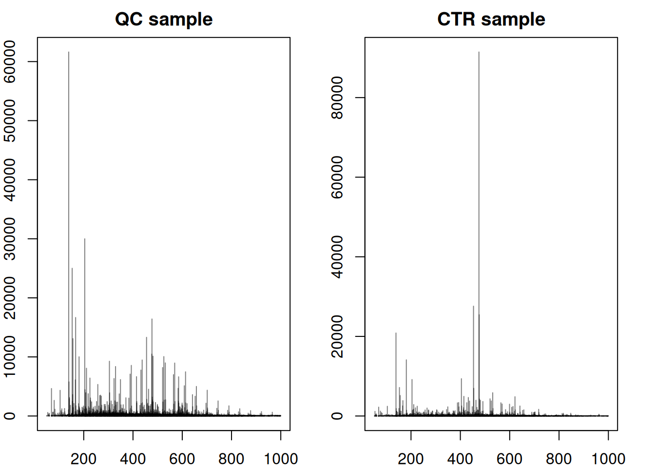
The significant dissimilarities in peak distribution and intensity confirm the difference in composition between QCs and study samples. We next compare a full MS1 spectrum from a CVD and a CTR sample.
#' Accessing a single spectrum - comparing CVD and CTR
par(mfrow = c(1,2), mar = c(2, 2, 2, 2))
spec1 <- spectra(lcms1[2])[125]
spec2 <- spectra(lcms1[3])[125]
plotSpectra(spec1, main = "CVD sample")
plotSpectra(spec2, main = "CTR sample")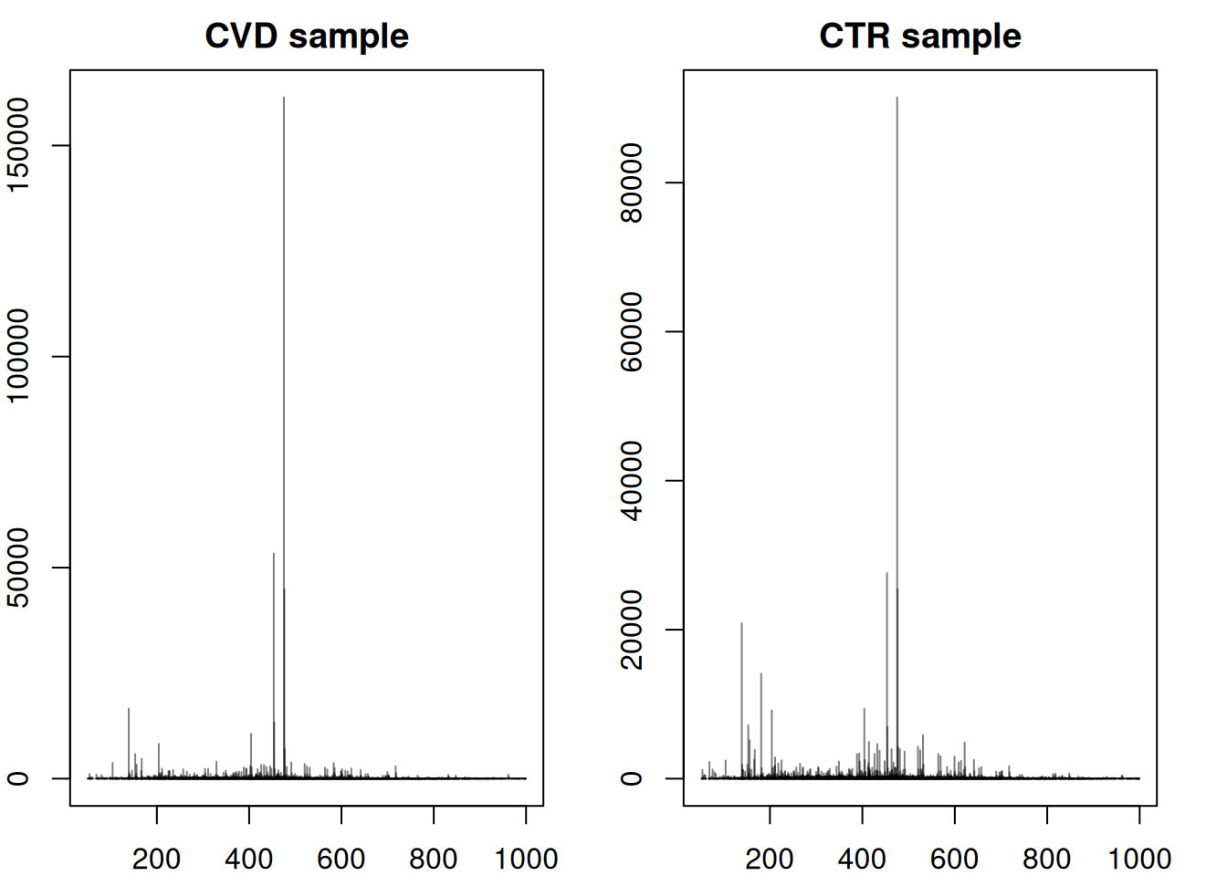
Above, we can observe that the spectra between CVD and CTR samples are not entirely similar, but they do exhibit similar main peaks between 200 and 600 m/z with a general higher intensity in control samples. However the peak distribution (or at least intensity) seems to vary the most between an m/z of 10 to 210 and after an m/z of 600.
The CTR spectrum above exhibits significant peaks around an m/z of 150 - 200 that have a much lower intensity in the CVD sample. To delve into more details about this specific spectrum, a wide range of functions can be employed:
#' Checking its intensity
intensity(spec2)
NumericList of length 1
[[1]] 18.3266733266736 45.1666666666667 ... 27.1048951048951 34.9020979020979
#' Checking its rtime
rtime(spec2)
[1] 34.872
#' Checking its m/z
mz(spec2)
NumericList of length 1
[[1]] 51.1677328505635 53.0461968245186 ... 999.139446289161 999.315208803072
#' Filtering for a specific m/z range and viewing in a tabular format
filt_spec <- filterMzRange(spec2,c(50,200))

data.frame(intensity = unlist(intensity(filt_spec)),
           mz = unlist(mz(filt_spec))) |>
head() |> kable(format = "markdown")| intensity | mz |
|---|---|
| 18.32667 | 51.16773 |
| 45.16667 | 53.04620 |
| 23.07692 | 53.70114 |
| 41.36364 | 53.84408 |
| 32.86713 | 53.88130 |
| 1159.03030 | 54.01002 |
Chromatographic info
Filter spectra
bpc <- chromatogram(lcms1, aggregationFun = "max")

#' Plot after filtering
plot(bpc, col = paste0(col_sample, 80),
     main = "BPC after filtering retention time", lwd = 1.5)
grid()
legend("topright", col = col_phenotype,
       legend = names(col_phenotype), lty = 1, lwd = 2, horiz = TRUE, bty = "n")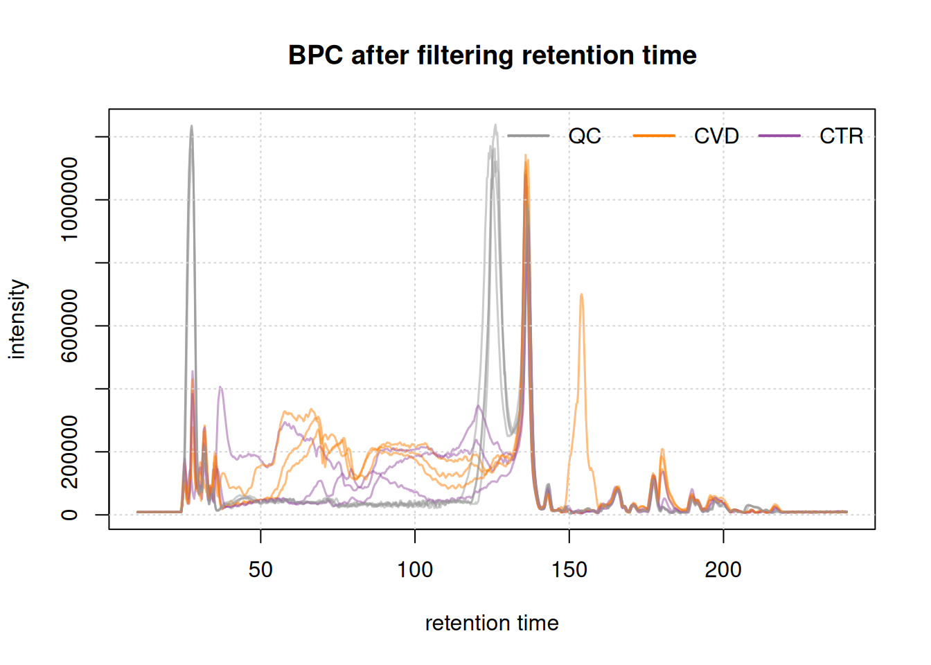
Initially, we examined the entire BPC and subsequently filtered it based on the desired retention times. This not only results in a smaller file size but also facilitates a more straightforward interpretation of the BPC.
The final plot illustrates the BPC for each sample colored by phenotype, providing insights on the signal measured along the retention times of each sample. It reveals the points at which compounds eluted from the LC column. In essence, a BPC condenses the three-dimensional LC-MS data (m/z by retention time by intensity) into two dimensions (retention time by intensity).
We can also here compare similarities of the BPCs in a heatmap. The retention times will however not be identical between different samples. Thus we bin() the chromatographic signal per sample along the retention time axis into bins of two seconds resulting in data with the same number of bins/data points. We can then calculate pairwise similarities between these data vectors using the cor() function and visualize the result using pheatmap().
#' Total ion chromatogram
tic <- chromatogram(lcms1, aggregationFun = "sum") |>
  bin(binSize = 2)

#' Calculate similarity (Pearson correlation) between BPCs
ticmap <- do.call(cbind, lapply(tic, intensity)) |>
  cor()

rownames(ticmap) <- colnames(ticmap) <- sampleData(lcms1)$sample_name
ann <- data.frame(phenotype = sampleData(lcms1)[, "phenotype"])
rownames(ann) <- rownames(ticmap)

#' Plot heatmap
pheatmap(ticmap, annotation_col = ann,
         annotation_colors = list(phenotype = col_phenotype))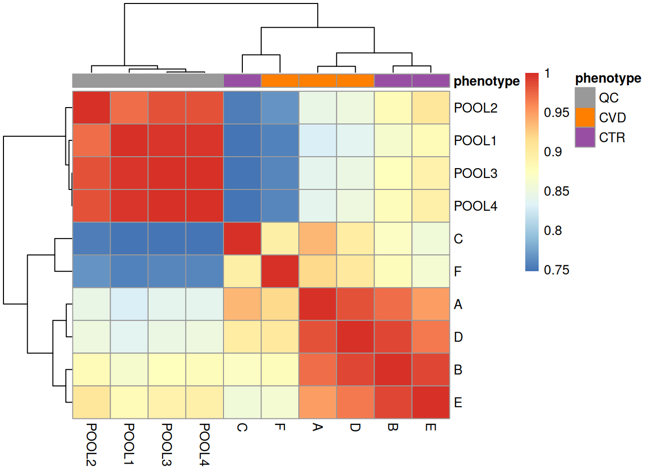
The heatmap above reinforces what our exploration of spectra data showed, which is a strong separation between the QC and study samples. This is important to bear in mind for later analyses.
Additionally, study samples group into two clusters, cluster I containing samples C and F and cluster II with all other samples. Below we plot the TIC of all samples, using a different color for each cluster.
cluster_I_idx <- sampleData(lcms1)$sample_name %in% c("F", "C")
cluster_II_idx <- sampleData(lcms1)$sample_name %in% c("A", "B", "D", "E")

temp_col <- c("grey", "red")
names(temp_col) <- c("Cluster II", "Cluster I")
col <- rep(temp_col[1], length(lcms1))
col[cluster_I_idx] <- temp_col[2]
col[sampleData(lcms1)$phenotype == "QC"] <- NA

lcms1 |>
    chromatogram(aggregationFun = "sum") |>
    plot( col = col,
     main = "TIC after filtering retention time", lwd = 1.5)
grid()
legend("topright", col = temp_col,
       legend = names(temp_col), lty = 1, lwd = 2,
       horiz = TRUE, bty = "n")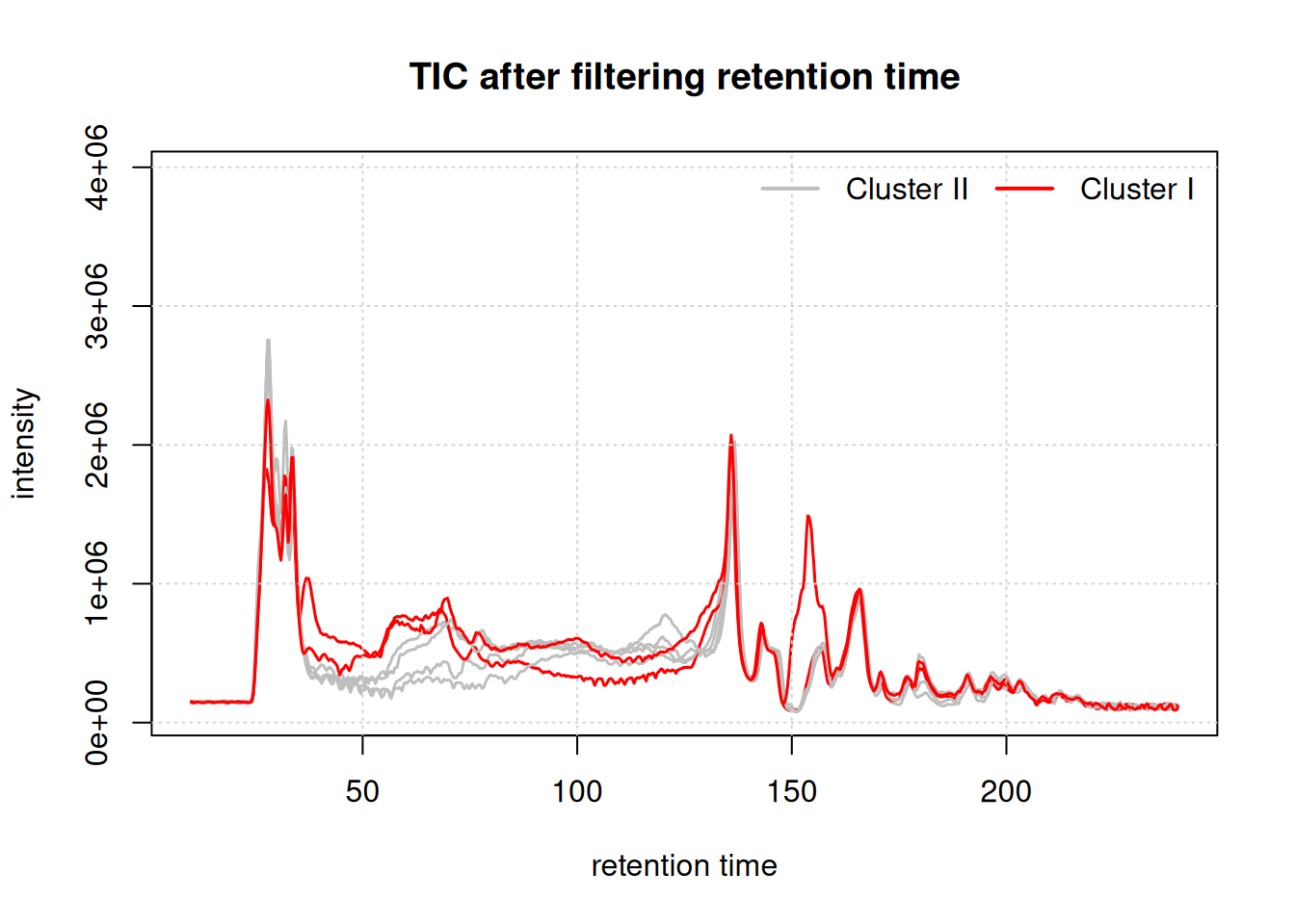
While the TIC of all samples look similar, the samples from cluster I show a different signal in the retention time range from about 40 to 160 seconds. Whether, and how strong this difference will impact the following analysis remains to be determined.
known compounds
While the artificially isotope labeled compounds were spiked to the individual samples, there should also be the signal from the endogenous compounds in serum (or plasma) samples. Thus, we calculate next the mass and m/z of an [M+H]+ ion of the endogenous cystine from its chemical formula and extract also the EIC from this ion. For calculation of the exact mass and the m/z of the selected ion adduct we use the calculateMass() and mass2mz() functions from the MetaboCoreUtils package.
#' extract endogenous cystine mass and EIC and plot.
cysmass <- calculateMass("C6H12N2O4S2")
cys_endo <- mass2mz(cysmass, adduct = "[M+H]+")[, 1]
eic_cys_endo <- chromatogram(lcms1, mz = cys_endo + c(-0.005, 0.005),
                             rt = c(199, 219), aggregationFun = "max")
eic_cys_spiked <-  chromatogram(lcms1 , mz = c(249.040276, 249.050276),
                                rt = c(199,219))

#' Plot versus spiked
par(mfrow = c(1, 2))
plot(eic_cys_endo, col = paste0(col_sample, 80))
grid()

plot(eic_cys_spiked, col = paste0(col_sample, 80))
grid()
legend("topright", col = col_phenotype, legend = names(col_phenotype),
       lty = 1, bty = "n")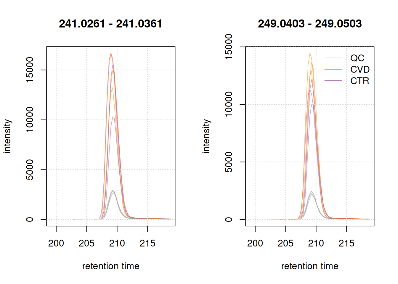
The two cystine EICs above look highly similar (the endogenous shown left, the isotope labeled right in the plot above), if not for the shift in m/z, which arises from the artificial labeling. This shift allows us to discriminate between the endogenous and non-endogenous compound.
Further post-processing analysis
Below we load the lcms1 object that we saved after preprocessing.
# load preprocessed xcmsExperiment
lcms1 <- readMsObject(XcmsExperiment(),
    AlabasterParam(system.file("extdata", "preprocessed_lcms1",
                               package = "Metabonaut")))

res <- readObject(system.file("extdata", "preprocessed_res",
                               package = "Metabonaut"))
Noise analysis
Below we plot the backgrounds signal for each study group. This can be interesting in cases on technical evaluation. In our cases we expect very similar background noise in both CVD and CTR.
# overall signal in the dataset
#' - for each file calculate the sum of intensities
background  <- spectra(lcms1) |>
    split(fromFile(lcms1)) |>
    lapply(tic) |>
    lapply(sum) |>
    unlist()

# Overall signal that is in the chromatographic peaks detection
detected <- apply(assay(res), 2, function(x) sum(x, na.rm = TRUE))

names(background) <- names(detected) <- res$phenotype
idx_qc <- sampleData(lcms1)$phenotype == "QC"
noise <- background[!idx_qc] - detected[!idx_qc]

f <- factor(names(noise), levels = unique(names(noise)))
group <- split(log2(noise), f)

plot(NULL, xlim = c(1, length(group)), ylim = range(unlist(group)),
     xaxt = "n", xlab = "Devices", ylab = "Noise",
     main = "log2 background signal comparison between study group")
for (i in seq_along(group)) {
  points(rep(i, length(group[[i]])), group[[i]], pch = 19)
}
axis(1, at = seq_along(group), labels = names(group))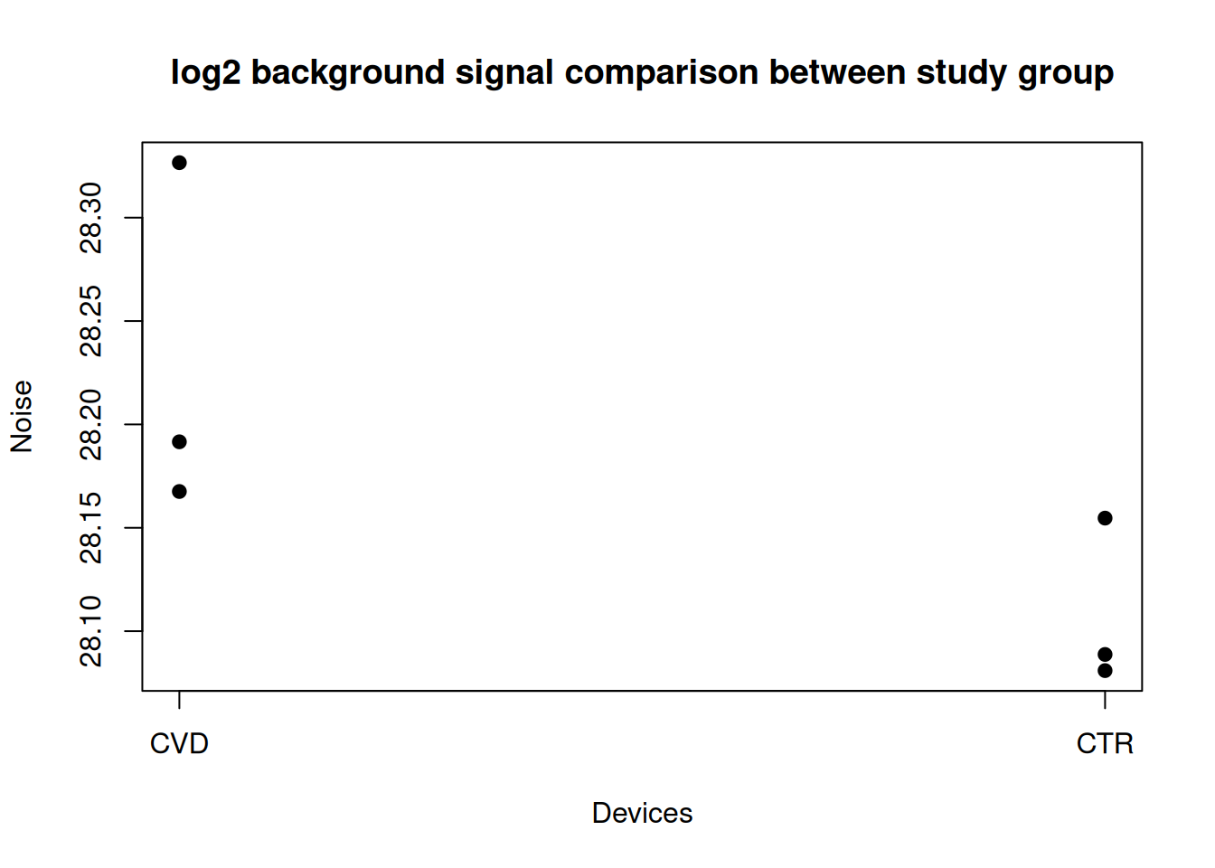
There seems to be more background noise in the CVD samples…
More coming soon…
Evaluating MS foreground and background signal
The difference between background and foreground signal of MS data files can also provide insights into data quality. Defining the background signal in an MS data file is however not trivial. The foreground signal could be defined as the biologically relevant or interesting signal while the noise or an offset/continuous signal could be defined as background signal. For LC-MS experiments foreground could be the signal of the measured compounds’ ions, i.e., the identified chromatographic peaks. Background signal could then be the full signal minus this foreground signal.
In the example below we evaluate this data for the first sample. We thus subset the xcms preprocessing result lcms1 to the first sample and apply the filterPeaksRanges() filter function to the Spectra object within that. As filters we use the m/z and retention time ranges of the chromatographic peaks of the first sample. We further expand the m/z range by 3ppm on each side since the reported "mzmin" and "mzmax" values from the centWave peak detection seemed to underestimate the actual m/z peak width slightly. Increasing m/z peak width by such a small value is not problematic for centroided data but it ensures the estimated background signal to not contain any foreground peak signals.
Using the keep parameter of the filterPeaksRanges() function it is possible to define whether the mass peaks matching the specified filters are kept or removed. We can thus keep or remove all mass peaks of the identified chromatographic peaks to define the foreground or background signal, respectively.
one <- lcms1[1L]

#' Define the m/z-rt areas for chromatographic peaks and expand them by 3ppm
peak_ranges <- chromPeaks(one)[, c("mzmin", "mzmax", "rtmin", "rtmax")]
peak_ranges[, "mzmin"] <- peak_ranges[, "mzmin"] -
    MsCoreUtils::ppm(peak_ranges[, "mzmin"], 3)
peak_ranges[, "mzmax"] <- peak_ranges[, "mzmax"] +
    MsCoreUtils::ppm(peak_ranges[, "mzmax"], 3)

#' Filter spectra keeping only mass peaks within the peak areas
one_fg <- filterSpectra(one, filterPeaksRanges,
                        mz = peak_ranges[, c("mzmin", "mzmax")],
                        rtime = peak_ranges[, c("rtmin", "rtmax")],
                        keep = TRUE)
#' Filter spectra removing mass peaks within the peak areas
one_bg <- filterSpectra(one, filterPeaksRanges,
                        mz = peak_ranges[, c("mzmin", "mzmax")],
                        rtime = peak_ranges[, c("rtmin", "rtmax")],
                        keep = FALSE)
The MS data of the one_fg variable contains now only mass peaks that are within the chromatographic peaks of that sample, and the one_bg variable the mass peaks outside of the chromatographic peaks. To illustrate this we plot below first the full MS data for a retention time and m/z range containing also the signal of a methionine ion. The lower panel of the plot contains the individual mass peaks in the region with their intensity color-coded. The area of identified chromatographic peaks is indicated with red rectangles. The upper panel shows the TIC signal of the data shown in the lower panel.
filterSpectra(one, filterRt, c(145, 175)) |>
    filterSpectra(filterMzRange, c(150, 160)) |>
    plot()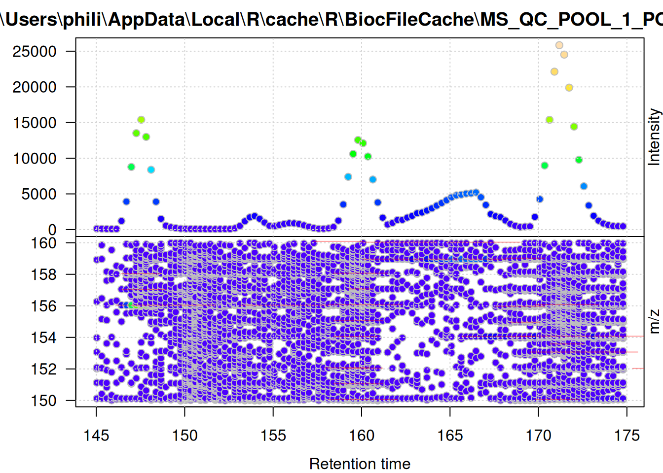
The same plot, but for the foreground signal defined above:
filterSpectra(one_fg, filterRt, c(145, 175)) |>
    filterSpectra(filterMzRange, c(150, 160)) |>
    plot()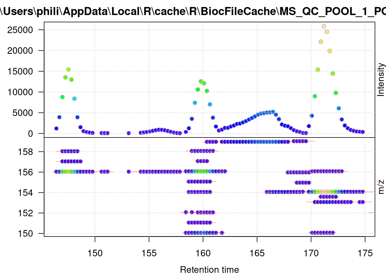
And the same for the background signal.
filterSpectra(one_bg, filterRt, c(145, 175)) |>
    filterSpectra(filterMzRange, c(150, 160)) |>
    plot()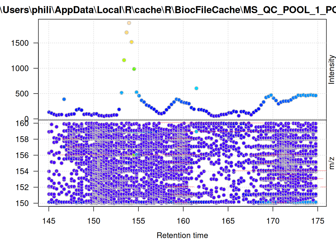
These plots show the effect of filtering the data set performed above - the foreground-only data contains all mass peaks within the chromatographic peak areas, while the background data contains (mostly) low abundant (background) signal, or signal that was not defined as, or included in, chromatographic peaks.
We can next extract the total ion chromatogram (TIC) from the full original data as well as from the foreground and background-only data.
#' Extract TIC
tic <- chromatogram(one, aggregationFun = "sum", chromPeaks = "none")
Extracting chromatographic data
tic_bg <- chromatogram(one_bg, aggregationFun = "sum", chromPeaks = "none")Extracting chromatographic data
tic_fg <- chromatogram(one_fg, aggregationFun = "sum", chromPeaks = "none")Extracting chromatographic data
par(mfrow = c(3, 1))
yl <- c(0, max(intensity(tic[[1L]])))
plot(tic, ylim = yl, main = "Total ion signal")
grid()
plot(tic_fg, ylim = yl, main = "Total foreground signal")
grid()
plot(tic_bg, ylim = yl, main = "Total background signal")
grid()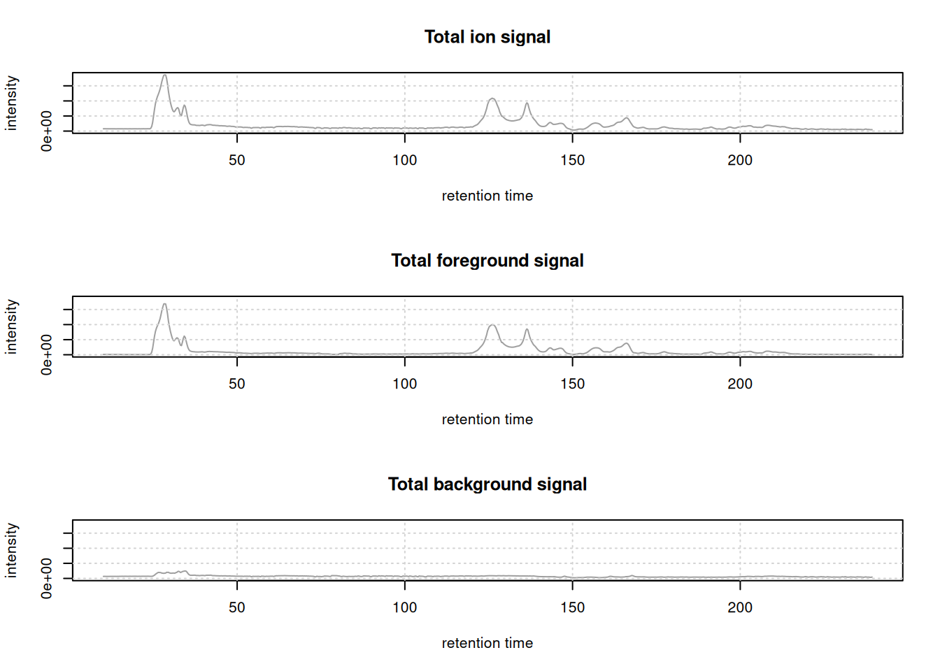
For the present (QC) sample, the background signal is much lower than the foreground signal.
To apply the same code on the full data set, we would need to filter in addition to the m/z and retention times also for the specific data file ($dataOrigin) of the chromatographic peak. For example, it would be possible to add an additional spectra variable defining the sample index and use this as an additional filter to the filterPeaksRanges() call:
cpks <- chromPeaks(lcms1)[, c("rtmin", "rtmax", "mzmin", "mzmax", "sample")]
spectra(lcms1)$sample_index <- spectraSampleIndex(lcms1)

lcms1_bg <- filterSpectra(
    lcms1, filterPeaksRanges,
    mz = cpks[, c("mzmin", "mzmax")],
    rtime = cpks[, c("rtmin", "rtmax")],
    sample_index = cbind(cpks[, "sample"] - 0.1, cpks[, "sample"] + 0.1),
    keep = FALSE)
It should however be noted that each individual filter (i.e., row in the matrices provided with mz and rtime) is evaluated iteratively and thus the performance of the filter step depends heavily on the number of rows of these matrices.
Session information
The R version and versions of packages used for this analysis are listed below.
R version 4.6.1 (2026-06-24)
Platform: x86_64-pc-linux-gnu
Running under: Ubuntu 24.04.4 LTS

Matrix products: default
BLAS:   /usr/lib/x86_64-linux-gnu/openblas-pthread/libblas.so.3
LAPACK: /usr/lib/x86_64-linux-gnu/openblas-pthread/libopenblasp-r0.3.26.so;  LAPACK version 3.12.0

locale:
 [1] LC_CTYPE=en_US.UTF-8       LC_NUMERIC=C
 [3] LC_TIME=en_US.UTF-8        LC_COLLATE=en_US.UTF-8
 [5] LC_MONETARY=en_US.UTF-8    LC_MESSAGES=en_US.UTF-8
 [7] LC_PAPER=en_US.UTF-8       LC_NAME=C
 [9] LC_ADDRESS=C               LC_TELEPHONE=C
[11] LC_MEASUREMENT=en_US.UTF-8 LC_IDENTIFICATION=C

time zone: Etc/UTC
tzcode source: system (glibc)

attached base packages:
[1] stats4    stats     graphics  grDevices utils     datasets  methods
[8] base

other attached packages:
 [1] pheatmap_1.0.13             RColorBrewer_1.1-3
 [3] pander_0.6.6                MetaboCoreUtils_1.20.1
 [5] xcms_4.10.1                 SummarizedExperiment_1.42.0
 [7] Biobase_2.72.0              GenomicRanges_1.64.0
 [9] Seqinfo_1.2.0               IRanges_2.46.0
[11] MatrixGenerics_1.24.0       matrixStats_1.5.0
[13] MsBackendMetaboLights_1.6.1 Spectra_1.22.2
[15] BiocParallel_1.46.0         S4Vectors_0.50.1
[17] BiocGenerics_0.58.1         generics_0.1.4
[19] MsIO_0.0.17                 MsExperiment_1.14.0
[21] ProtGenerics_1.44.0         BiocStyle_2.40.0
[23] quarto_1.5.1.9002           knitr_1.51

loaded via a namespace (and not attached):
  [1] rstudioapi_0.19.0           jsonlite_2.0.0
  [3] MultiAssayExperiment_1.38.0 magrittr_2.0.5
  [5] farver_2.1.2                MALDIquant_1.22.3
  [7] rmarkdown_2.31              fs_2.1.0
  [9] vctrs_0.7.3                 memoise_2.0.1
 [11] htmltools_0.5.9             S4Arrays_1.12.0
 [13] progress_1.2.3              curl_7.1.0
 [15] Rhdf5lib_2.0.0              SparseArray_1.12.2
 [17] rhdf5_2.56.0                mzID_1.50.0
 [19] alabaster.base_1.12.1       plyr_1.8.9
 [21] httr2_1.3.0                 impute_1.86.0
 [23] cachem_1.1.0                igraph_2.3.3
 [25] lifecycle_1.0.5             iterators_1.0.14
 [27] pkgconfig_2.0.3             Matrix_1.7-5
 [29] R6_2.6.1                    fastmap_1.2.0
 [31] clue_0.3-68                 digest_0.6.39
 [33] pcaMethods_2.4.0            ps_1.9.3
 [35] RSQLite_3.53.3              filelock_1.0.3
 [37] abind_1.4-8                 compiler_4.6.1
 [39] bit64_4.8.2                 withr_3.0.3
 [41] doParallel_1.0.17           S7_0.2.2
 [43] PTMods_1.0.0                DBI_1.3.0
 [45] alabaster.ranges_1.12.0     HDF5Array_1.40.0
 [47] alabaster.schemas_1.12.0    MASS_7.3-66
 [49] DelayedArray_0.38.2         mzR_2.46.0
 [51] tools_4.6.1                 PSMatch_1.16.0
 [53] otel_0.2.0                  glue_1.8.1
 [55] h5mread_1.4.0               QFeatures_1.22.0
 [57] rhdf5filters_1.24.0         grid_4.6.1
 [59] cluster_2.1.8.2             reshape2_1.4.5
 [61] gtable_0.3.6                preprocessCore_1.74.0
 [63] tidyr_1.3.2                 data.table_1.18.4
 [65] hms_1.1.4                   XVector_0.52.0
 [67] foreach_1.5.2               pillar_1.11.1
 [69] stringr_1.6.0               limma_3.68.4
 [71] later_1.4.8                 dplyr_1.2.1
 [73] BiocFileCache_3.2.0         lattice_0.22-9
 [75] bit_4.6.0                   tidyselect_1.2.1
 [77] xfun_0.60                   statmod_1.5.2
 [79] MSnbase_2.37.0              stringi_1.8.7
 [81] lazyeval_0.2.3              yaml_2.3.12
 [83] evaluate_1.0.5              codetools_0.2-20
 [85] MsCoreUtils_1.24.0          tibble_3.3.1
 [87] alabaster.matrix_1.12.0     BiocManager_1.30.27
 [89] cli_3.6.6                   affyio_1.82.0
 [91] processx_3.9.0              Rcpp_1.1.2
 [93] MassSpecWavelet_1.78.2      dbplyr_2.6.0
 [95] XML_3.99-0.23               parallel_4.6.1
 [97] ggplot2_4.0.3               blob_1.3.0
 [99] prettyunits_1.2.0           AnnotationFilter_1.36.0
[101] alabaster.se_1.12.0         MsFeatures_1.20.0
[103] scales_1.4.0                affy_1.90.0
[105] ncdf4_1.24                  purrr_1.2.2
[107] crayon_1.5.3                rlang_1.3.0
[109] vsn_3.80.0