Introduction
Herein, we will perform normalization and feature selection using the notame R packages, originally developed in parallel with a protocol article published in the “Metabolomics Data Processing and Data Analysis—Current Best Practices” special issue of the Metabolites journal (Klåvus et al. 2020). The main outcome is identifying interesting features for laborious downstream steps relating to biological context, such as annotation and pathway analysis, which fall outside the purview of notame. The associated protocol article presents a sequence of steps that is easily adopted by new practitioners. We will not follow the protocol article exactly and instead do an analysis which meshes with the trunk of the end-to- end Metabonaut workflow.
The normalization process is based on QC samples so the sample size here is limiting, with only four QC samples. The QC samples were also pooled from another sample collection, whereas typically, the QC samples would be pooled from the same sample collection. These limitations will become evident below, so we make an effort to explain the basic things one would want to look out for.
Setup
Let’s prepare by attaching packages and loading the preprocessed data as a SummarizedExperiment object returned from MSExperiment::quantify().
class: SummarizedExperiment
dim: 9068 10
metadata(0):
assays(2): raw raw_filled
rownames(9068): FT0001 FT0002 ... FT9067 FT9068
rowData names(11): mzmed mzmin ... QC ms_level
colnames(10): MS_QC_POOL_1_POS.mzML MS_A_POS.mzML ... MS_F_POS.mzML
  MS_QC_POOL_4_POS.mzML
colData names(11): sample_name derived_spectra_data_file ... phenotype
  injection_index
The SummarizedExperiment container supports several assays. In notame, you need to specify the assay using the assay.type parameter if using multiple assays. Herein, we have two assays: “raw” contains the detected peaks without gap-filling, whereas “raw_filled” contains the gap-filled peak table. For this demo to go smoothly, we prepare the SummarizedExperiment object for all the functions at once, mostly by renaming and creating columns.
# Rename columns of sample data
rename_ind <- which(colnames(colData(se)) %in%
                    c("sample_name", "sample_type", "injection_index"))
colnames(colData(se))[rename_ind] <- c("Sample_ID", "QC", "Injection_order")
# Change rownames to be identical with "Sample_ID" column
colnames(se) <- colData(se)$Sample_ID
# Change name of pooled samples to "QC" in the "QC" column
se$QC[se$QC == "pool"] <- "QC"
# Convert phenotype column to factor
se$phenotype <- as.factor(se$phenotype)

# In feature data, create Feature_ID column from rownames
rowData(se) <- cbind(Feature_ID = rownames(se), rowData(se))
# Create "Split" column with analytical mode
rowData(se)$Split <- "HILIC_pos"
# Create "Flag" column for flagging low-quality features
rowData(se)$Flag <- NA

# Convert assay from DelayedMatrix to regular matrix
assay(se, "raw_filled") <- as.matrix(assay(se, "raw_filled"))
assay(se, "raw") <- as.matrix(assay(se, "raw"))
Normalization
Features with a low detection rate are flagged, as they are deemed too unreliable not only for statistical analysis, but also for the normalization process which relies heavily on QC samples. Flagged features are automatically excluded in most functions in notame, but can be included using all_features = TRUE. We set the detection rate threshold for QC samples at 70% (Broadhurst et al. 2018), plus a within-group threshold of 80%. The within-group threshold must be met in at least one study group.
se <- flag_detection(se, qc_limit = 0.7, group_limit = 0.8,
                     group = "phenotype", assay.type = "raw_filled")
Next, we correct for drift using a cubic spline, relating each features’ abundance in QC samples to injection order (Kirwan et al. 2013). Drift correction is performed in log-space since the log transformed data better follows assumptions of cubic spline regression. The value for the smoothing parameter is, by default, optimized using leave-one-out cross-validation to avoid overfitting. The abundances are corrected by adding the mean of a feature’s abundance in the QC samples and subtracting the predicted fit for each feature.
se <- correct_drift(se, assay.type = "raw_filled", name = "drift_norm")
Brief notes about drift correction are stored in the DC_note column of feature data. For example, it is noted if drift correction couldn’t be performed because because at least four QC samples with values are needed for fitting the cubic spline.
Next, we apply probabilistic quotient normalization (PQN) to reduce unwanted variation from differential dilution of samples (Dieterle et al. 2006). The central challenge here is to reduce unwanted variation from dilution, whether biological or experimental, while accounting for the possibility of biologically meaningful variation in total feature abundances. In probabilistic quotient normalization, the most probable dilution factor is determined for each sample as the median of quotients calculated for each feature relative to the median of each feature’s abundance in reference samples. The sample abundances are then divided by the dilution factor. Below, we use quality features in QC samples as reference, although the literature suggests that the choice of reference samples isn’t critical (Dieterle et al. 2006).
se <- pqn_normalization(se, ref = "qc", method = "median",
                        assay.type = "drift_norm", name = "dil_norm")
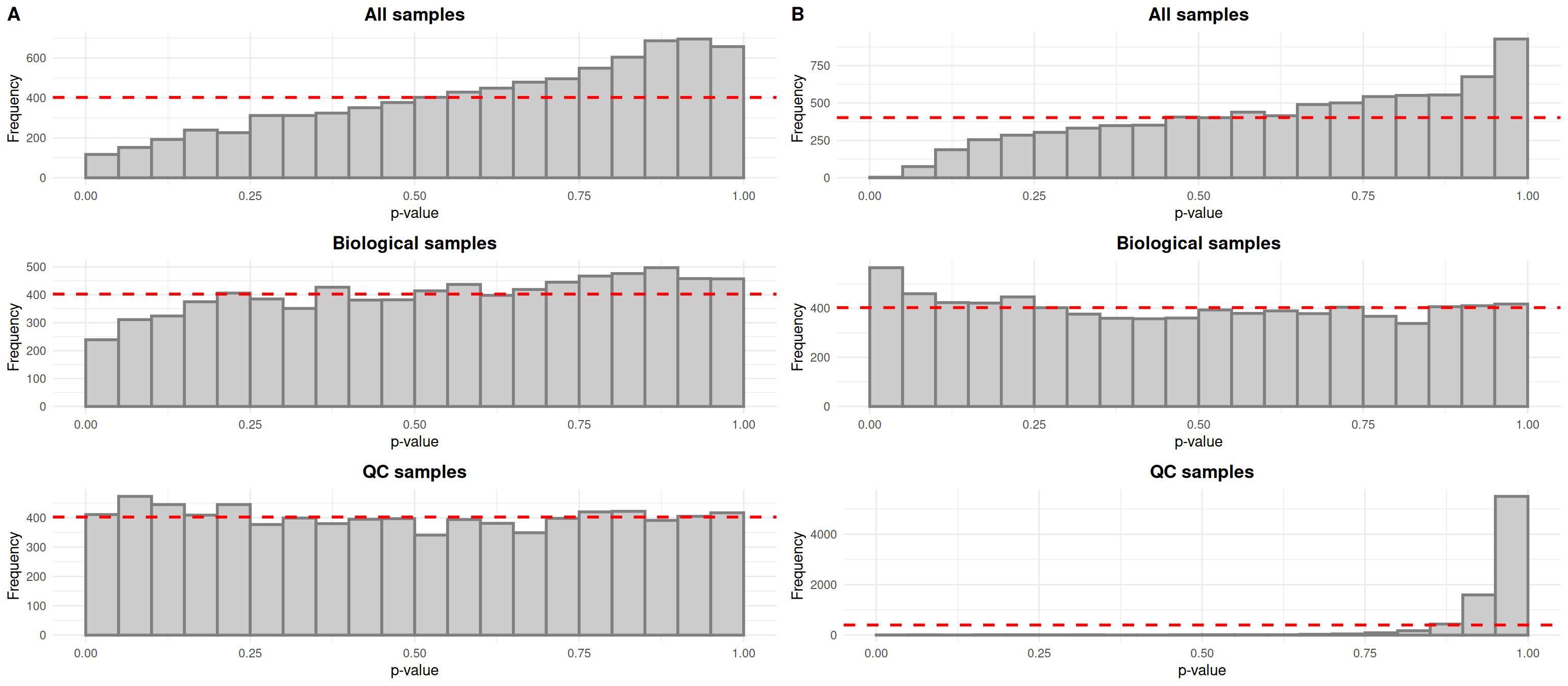
Next, let’s visualize the data before and after normalization for drift and dilution using the notameViz package. Typically, the data would be assessed visually after each step of the normalization process, using the save_QC_plots() wrapper to save relevant plots. Herein, the data is visualized side-by-side after normalization for both drift and dilution for conciseness. The are many parameters for customizing the visualizations, but here we stick to the basics of coloring, shaping and ordering the samples to best represent what is of interest.
Typically, drift in the biological samples would be evidenced by an overabundance of low p-values in histograms relating each features’ abundance to injection order. After drift correction, the distributions would be expected to be more uniform for all samples and biological samples. In the case of QC samples, an overabundance of high p-values is expected given that the QC samples are identical.
The QC samples behave as expected, but it seems that the small number of samples does not allow us to fit linear models relating abundance to injection order properly for all samples and biological samples, as evidenced by the overabundance of high p-values in the top histograms.
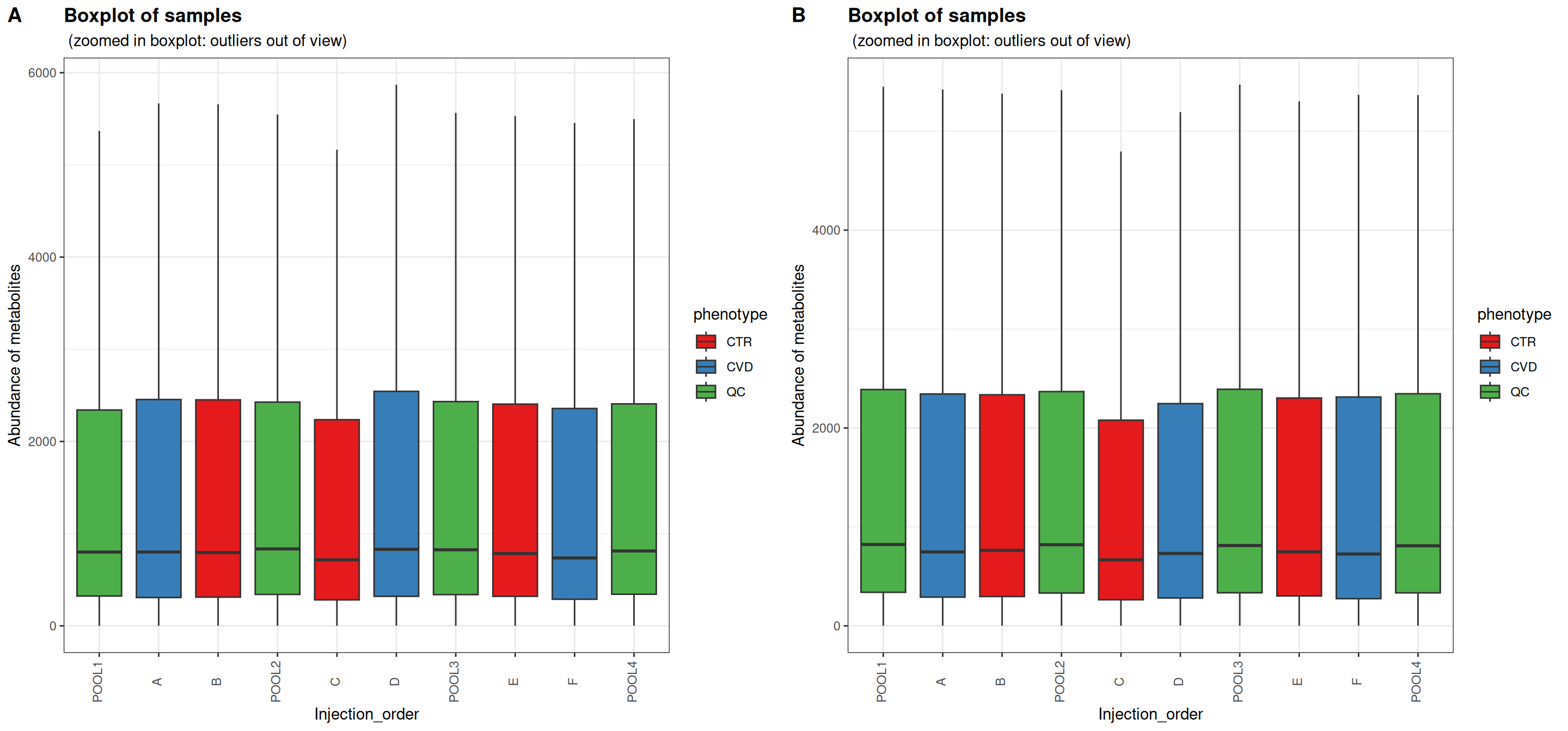
Sample boxplots are useful for inspecting the distributions of feature abundances. One would expect the QC samples to be more alike after normalization for drift and dilution. Depending on the instrumentation and experimental details, drift may be apparent as a global trend or the effect of drift is cancelled out.
In this case, the distributions of feature abundances are only slightly shifted after normalization. The QC samples appear not to have been affected by PQN. No obvious differences can be seen within study groups or between study groups either. PQN generally decreased the abundances of the biological samples to levels more similar to the QC samples. This comes from a dilution factor of over one for each of the biological samples, reflecting the different source and processing of QC samples.
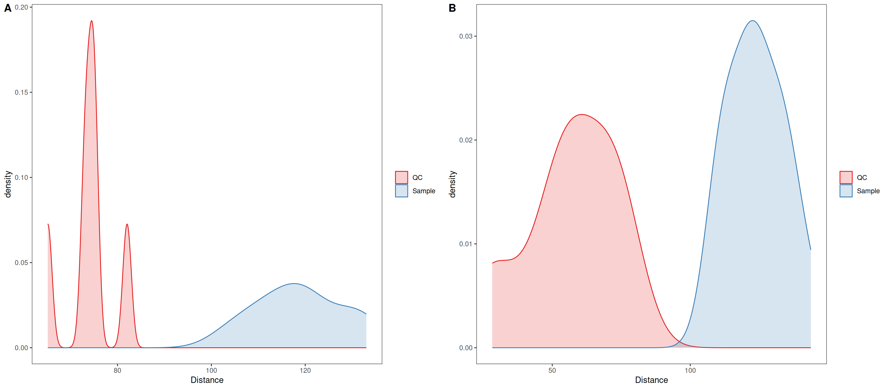
For the remaining visualizations which all involve Euclidean distances, the data was autoscaled. Conservative interpretation focusing on the QC samples is enough to assess the normalization process, but intuitions about the data at large can be formed based on the biological samples.
In distance density plots, one would generally expect a single prominent density peak for QC samples and greater separation between QC samples and biological samples after normalization, which also is the case herein. The separation between QC samples and biological samples has not increased, although in this case it may be an artifact from the sample size affecting the kernel density estimate.
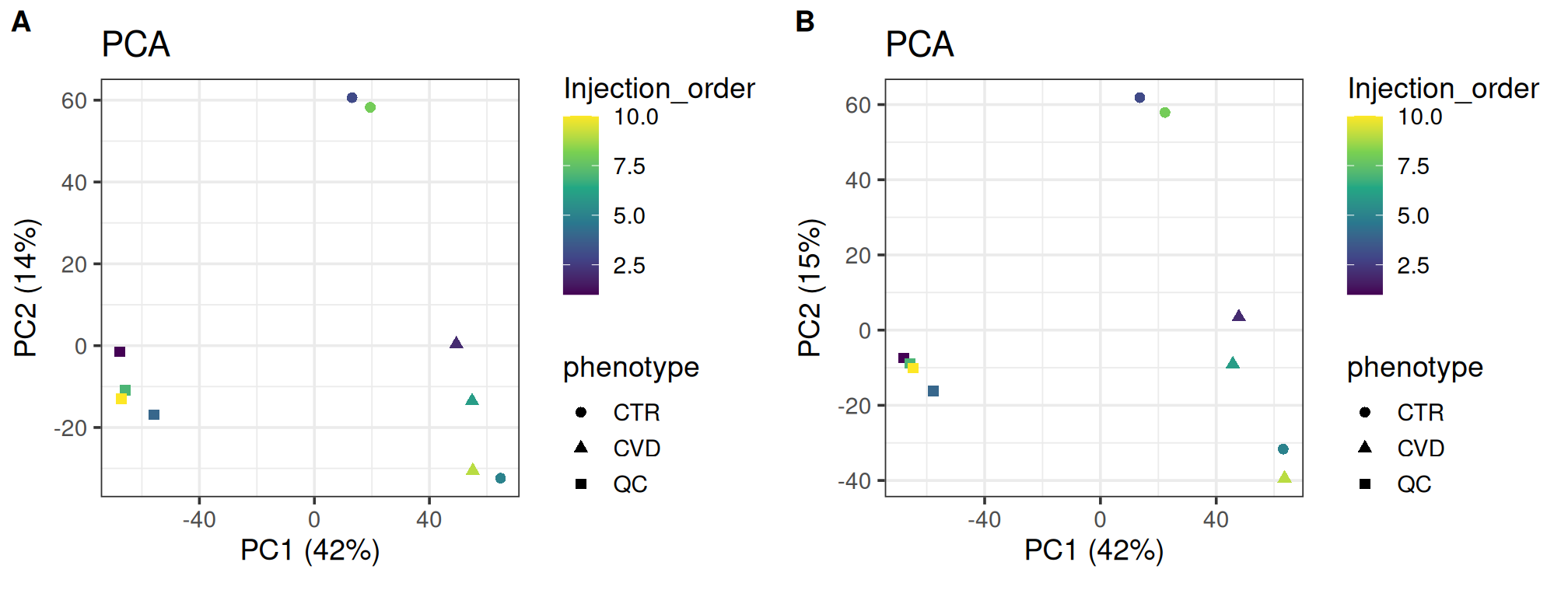
PCA is useful for visualizing the similarity of individual samples and groups as it represents the data along axes which, consecutively, maximally explains the variation. PCA is especially useful in an exploratory sense, allowing us to relate covariates to the grouping of samples. Typically, the QC samples will group more tightly after normalization and the overall structure is preserved. The variation explained by the first principal components can also be expected to increase as normalization should reduce the masking effect of unwanted variation.
As expected, the overall structure is intact and the QC samples group more tightly, indicating that we have reduced unwanted variation. The CVD group seems to group more tightly after normalization; the opposite can be said for the CTR group. Such local differences could be investigated further using t-SNE and coloring for injection order. There is little difference in the variance explained by the first two components.
plot_grid(plot_pca(se, color = "Injection_order",
                   shape = "phenotype", assay.type = "raw_filled"),
          plot_pca(se, color = "Injection_order",
                   shape = "phenotype", assay.type = "dil_norm"),
          labels = "AUTO")
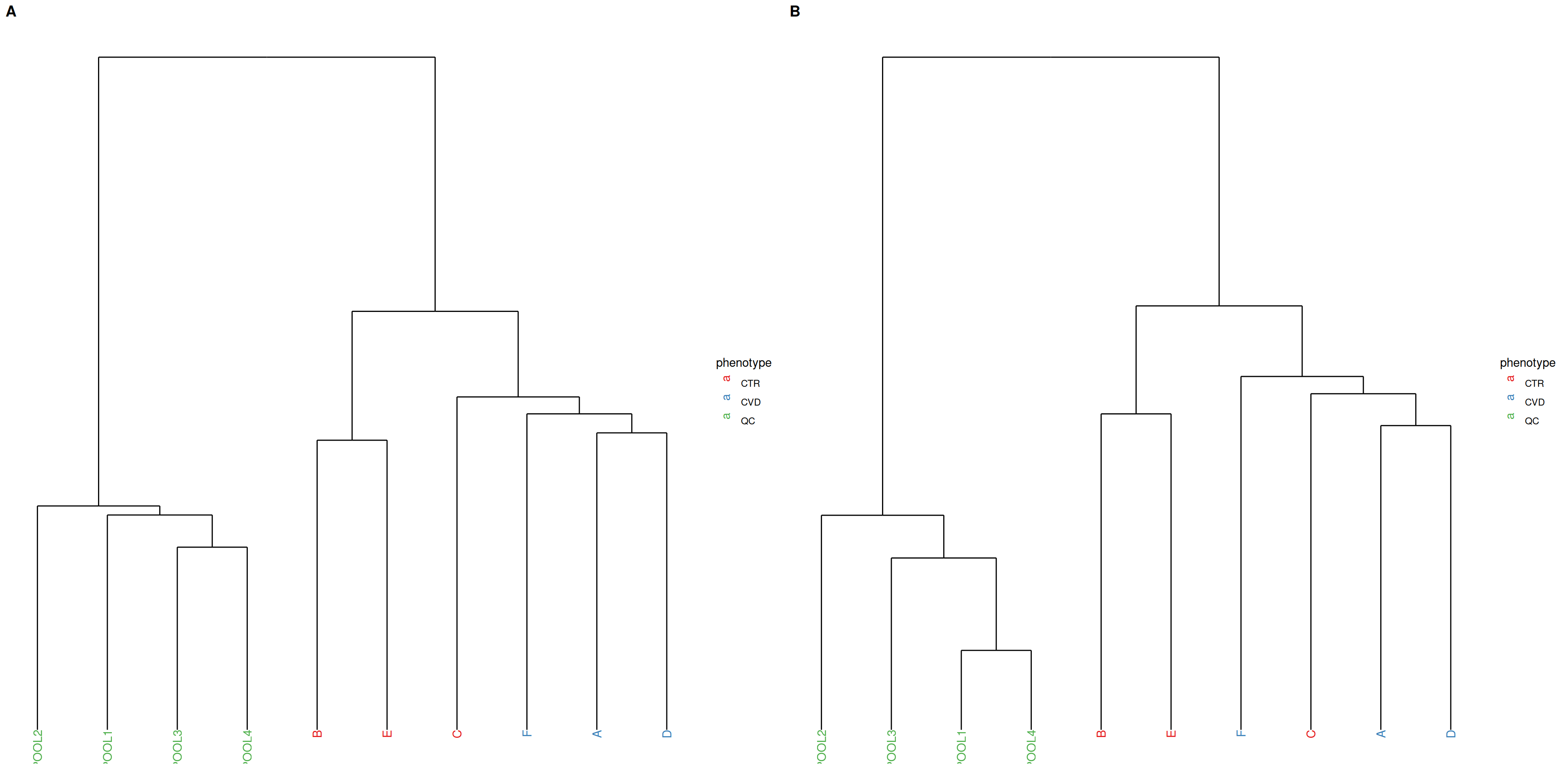
PCA and hierarchical clustering using Ward’s criterion are complementary unsupervised methods operating in Euclidean space. While PCA focuses on explaining the variation with maximally reduced dimensionality, hierarchical clustering allows observation of relationships between samples at higher resolution by minimizing within-cluster variation in the clustering of samples. Tighter clustering of QC samples is expected. Hierarchical clustering is generally more sensitive to noise than PCA.
In the present case, the QC samples appear more dissimilar after normalization, so we may actually have ended up increasing unwanted variation.
plot_grid(plot_dendrogram(se, color = "phenotype", assay.type = "raw_filled",
                          title = NULL, subtitle = ""),
          plot_dendrogram(se, color = "phenotype", assay.type = "dil_norm",
                          title = NULL, subtitle = ""),
          labels = "AUTO")
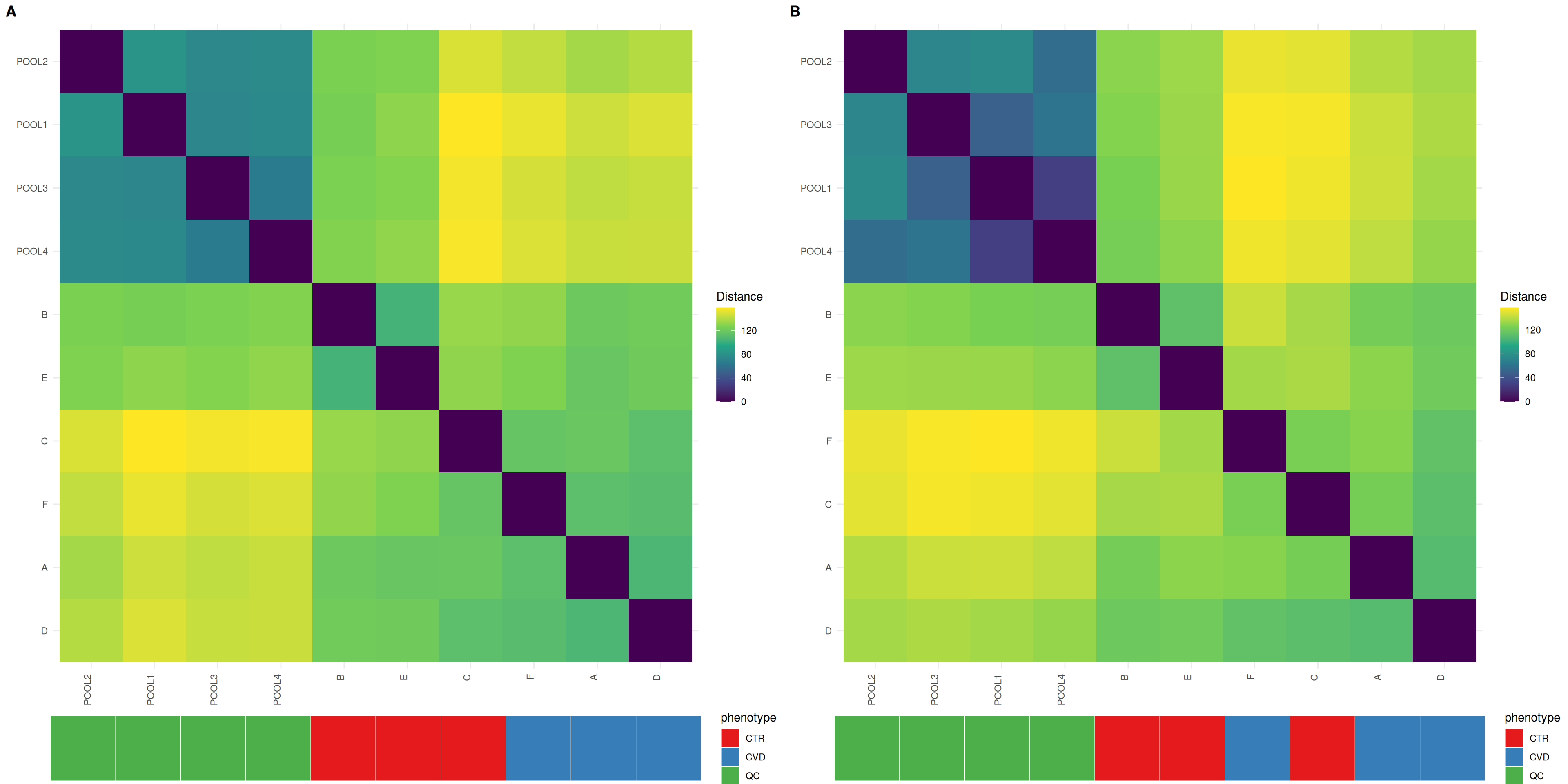
Heatmaps give insight into the actual distances between samples, where the distances between QC samples should be smaller after normalization. Organizing the heatmap as per hierachical sample clusters using Ward’s criterion facilitates interpretation. The QC samples should appear as a darker, more uniform square.
In unison with the density plots, we can observe less distance between QC samples, although the less uniform QC sample block suggests that all QC samples did not respond equally to the normalization process.
plot_grid(plot_sample_heatmap(se, group = "phenotype",
                              assay.type = "raw_filled",
                              title = NULL, subtitle = ""),
          plot_sample_heatmap(se, group = "phenotype", assay.type = "dil_norm",
                              title = NULL, subtitle = ""),
          labels = "AUTO")
Feature prefiltering
We flag low-quality features, excluding them from downstream steps. In addition to the D-ratio and detection rate in the trunk of the workflow, we flag features by their relative standard deviation in QC samples. The non- parametric, robust versions of the D-ratio and relative standard deviation are used(Broadhurst et al. 2018).
| HILIC_pos |
4498 |
716 |
303 |
3551 |
9068 |
4570 |
Finally, we impute missing values. Using random forest imputation, we can accommodate the possibility of missing values arising not only from the limit of detection, but also because of issues in gap-filling. We drop QC samples so as not to bias the imputation. The strict thresholds for quality metrics and detection rate allow us to be more confident in our imputed values.
The data is now ready for feature selection with differential abundance analysis. It’s handy to save pretreated data in a separate object and continue with a single assay for the remainder of the analysis. We also drop flagged features, although low-quality features can be needed in annotation when searching for specific ions or fragments of known molecules.
The out-of-bag error is promising. Now the data is ready for feature selection.
Differential abundance analysis
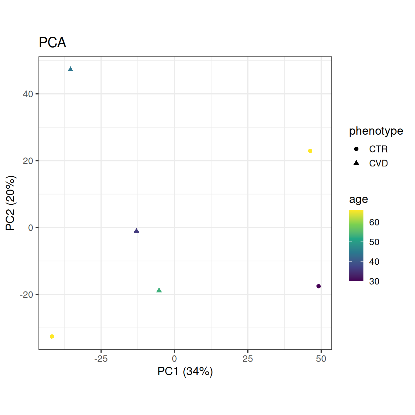
Let’s get a final look at the data with PCA, this time without QC samples and coloring by the only available clinical covariate, age.
plot_pca(base, color = "age", shape = "phenotype")
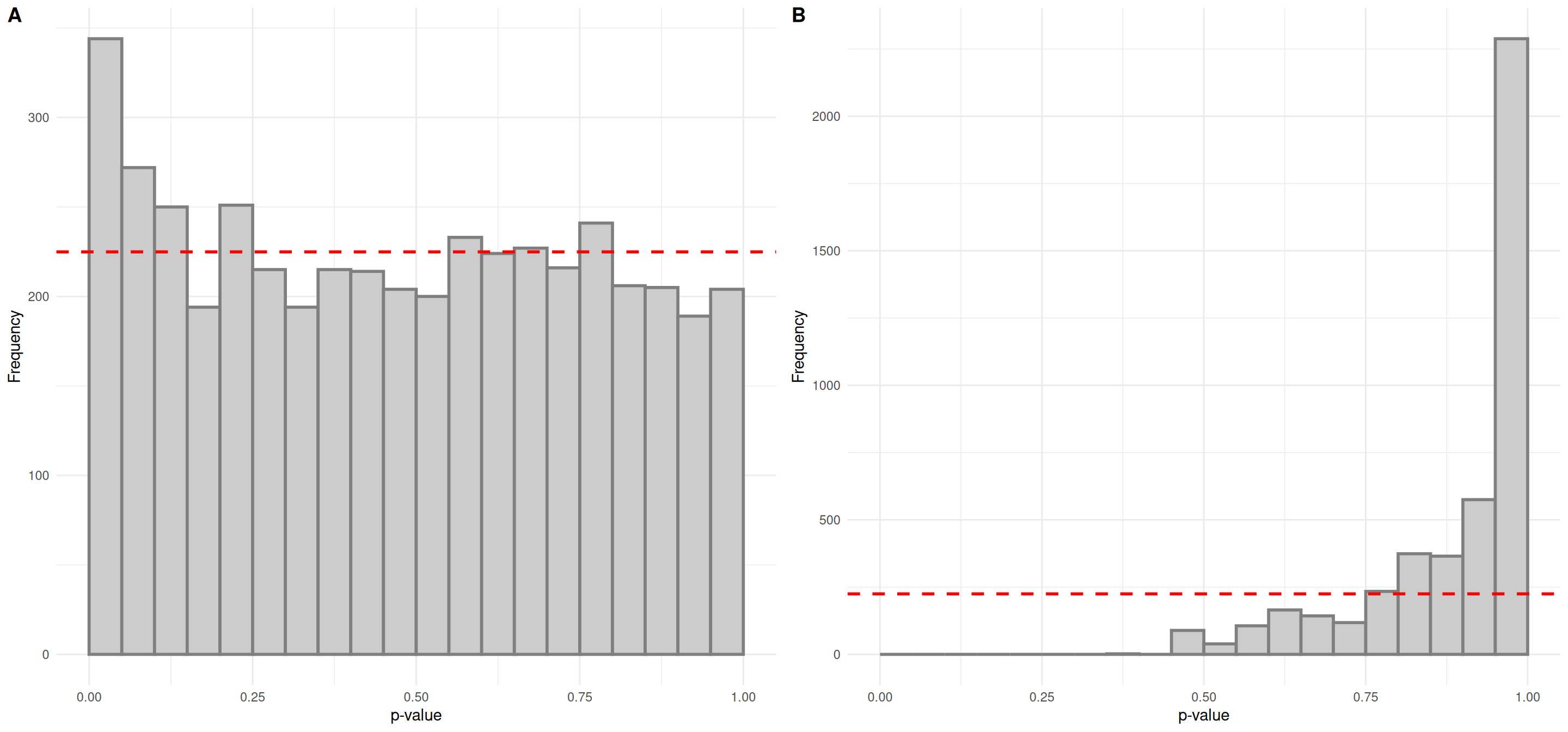
We’ll use linear models to find interesting features, adjust for false positives from multiple testing using the false discovery rate approach and plot the results in histograms to assess validity of the tests and get a feel for the results. The formula interface is used in most univariate statistics functions in notameStats for flexibility. By default, linear models are fit for each feature but correction for multiple testing is only applied for quality features. Here we also use join_rowData() to add the results to the object.
assay(base, "log2") <- log2(assay(base))
lm_results <- perform_lm(base, assay.type = "log2",
                         formula_char = "Feature ~ phenotype + age")
base <- join_rowData(base, lm_results[, c("Feature_ID", "phenotypeCVD.p.value",
                                          "phenotypeCVD.p.value_FDR",
                                          "phenotypeCVD.estimate")])

plot_grid(plot_p_histogram(list(lm_results$phenotypeCVD.p.value)),
          plot_p_histogram(list(lm_results$phenotypeCVD.p.value_FDR)),
          labels = "AUTO")
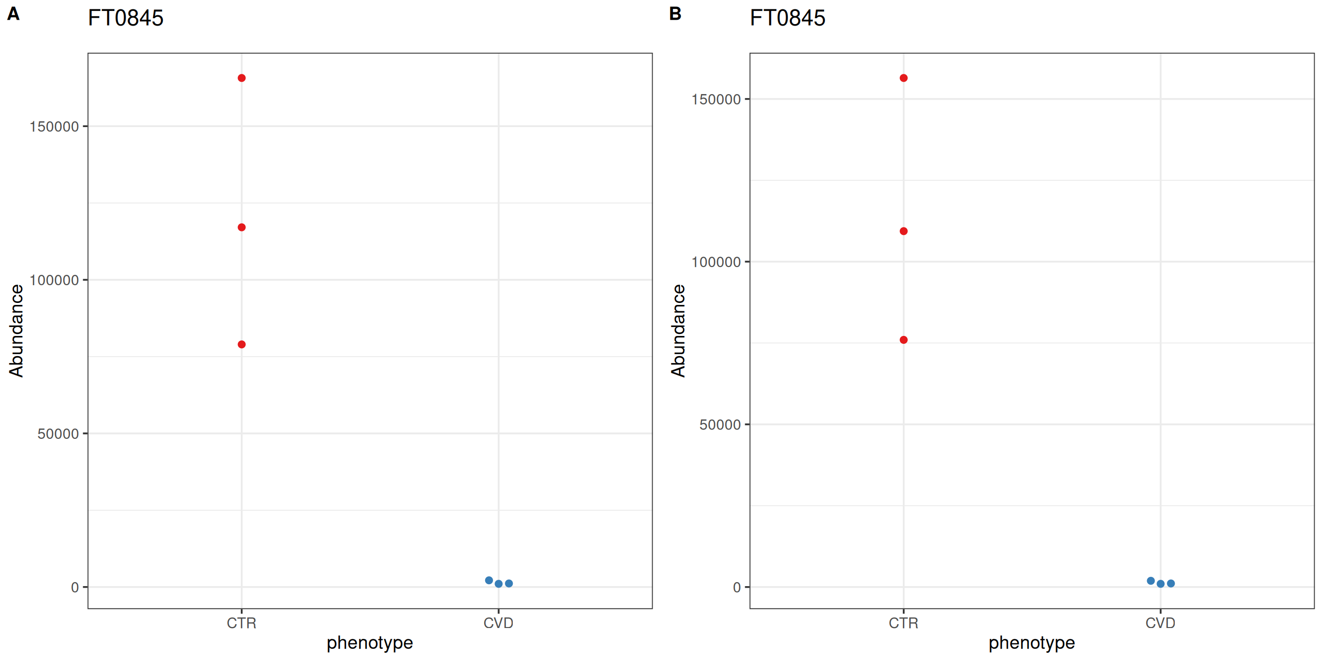
The p-value histogram for looks promising; it is a relatively uniform distribution with an overabundance of low p-values. However, there are no significant features after correction for multiple testing. For demonstration purposes, we’ll consider the feature “FT0845”, which was identified as caffeine in the trunk of the workflow, most interesting.
After differential abundance analysis or feature selection using supervised learning, for example, the number of significant features or a ranking cutoff allows for manual inspection of feature-wise plots. notameViz includes a variety of feature-wise visualizations adaptable to a variety of study designs. For feature “FT0845”, the abundance of CTR samples is reduced after normalization.
plot_grid(save_beeswarm_plots(pretreated["FT0845", ], x = "phenotype",
                              color = "phenotype", save = FALSE,
                              assay.type = "raw_filled")[[1]],
          save_beeswarm_plots(base["FT0845", ], x = "phenotype",
                              color = "phenotype", save = FALSE,
                              assay.type = "imputed")[[1]],
          labels = "AUTO")
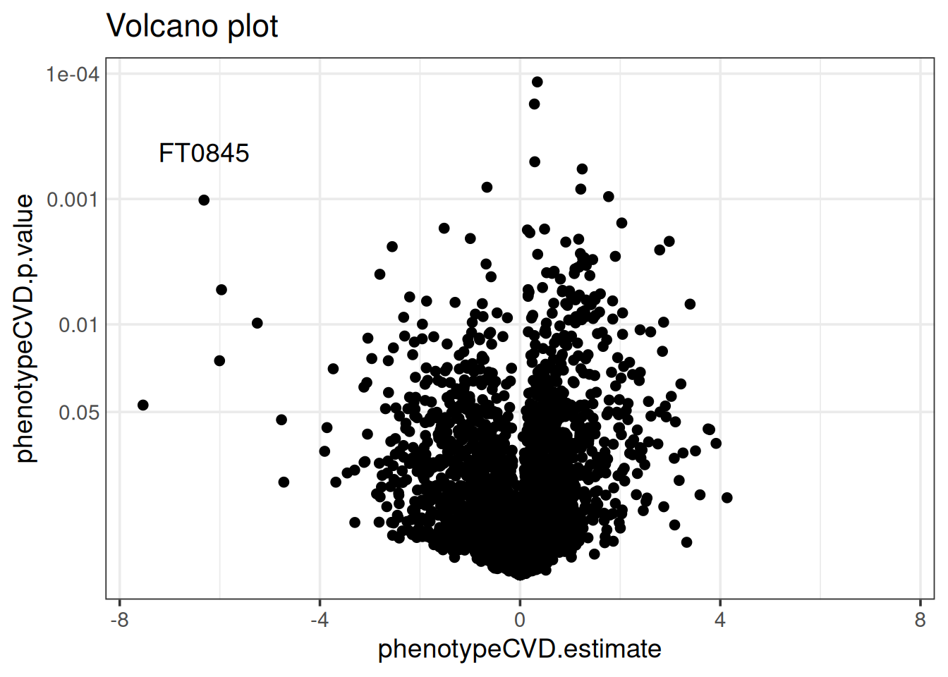
The results are also visualized with a variety of comprehensive visualizations. The volcano plot below shows that feature “FT0845” is distinct in having a low p-value and the second-largest fold-change. Manhattan plots and cloud plots could also be used to inspect how interesting features relate to m/z and retention time. We often co-visualize results from differential abundance analysis with a ranking of features from supervised learning for a combined perspective.
volcano_plot(base, x = "phenotypeCVD.estimate",
             p = "phenotypeCVD.p.value") +
  geom_text(data = rowData(base)["FT0845", ],
            aes(label = "FT0845"),
            vjust = -2)
Conclusion
Caffeine is a mild diuretic and can concentrate blood in high doses, so a difference in biological dilution between the study groups can be expected. The overall structure of the data seems to be intact after normalization. On the other hand, the QC samples were from a different source so the most probable dilution factors may not have been determined accurately for the biological samples and drift correction likely suffered as well.
R version 4.5.2 (2025-10-31)
Platform: x86_64-pc-linux-gnu
Running under: Ubuntu 24.04.3 LTS

Matrix products: default
BLAS:   /usr/lib/x86_64-linux-gnu/openblas-pthread/libblas.so.3
LAPACK: /usr/lib/x86_64-linux-gnu/openblas-pthread/libopenblasp-r0.3.26.so;  LAPACK version 3.12.0

locale:
 [1] LC_CTYPE=en_US.UTF-8       LC_NUMERIC=C
 [3] LC_TIME=en_US.UTF-8        LC_COLLATE=en_US.UTF-8
 [5] LC_MONETARY=en_US.UTF-8    LC_MESSAGES=en_US.UTF-8
 [7] LC_PAPER=en_US.UTF-8       LC_NAME=C
 [9] LC_ADDRESS=C               LC_TELEPHONE=C
[11] LC_MEASUREMENT=en_US.UTF-8 LC_IDENTIFICATION=C

time zone: Etc/UTC
tzcode source: system (glibc)

attached base packages:
[1] stats4    stats     graphics  grDevices utils     datasets  methods
[8] base

other attached packages:
 [1] notameStats_1.0.0           notameViz_1.0.2
 [3] notame_1.0.1                ggplot2_4.0.2
 [5] limma_3.66.0                cowplot_1.2.0
 [7] BiocParallel_1.44.0         alabaster.se_1.10.0
 [9] alabaster.base_1.10.0       SummarizedExperiment_1.40.0
[11] Biobase_2.70.0              GenomicRanges_1.62.1
[13] Seqinfo_1.0.0               IRanges_2.44.0
[15] S4Vectors_0.48.0            BiocGenerics_0.56.0
[17] generics_0.1.4              MatrixGenerics_1.22.0
[19] matrixStats_1.5.0           quarto_1.5.1.9002
[21] knitr_1.51

loaded via a namespace (and not attached):
 [1] tidyselect_1.2.1         viridisLite_0.4.3        vipor_0.4.7
 [4] dplyr_1.2.0              farver_2.1.2             S7_0.2.1
 [7] fastmap_1.2.0            digest_0.6.39            lifecycle_1.0.5
[10] alabaster.matrix_1.10.0  statmod_1.5.1            processx_3.8.6
[13] magrittr_2.0.4           compiler_4.5.2           rngtools_1.5.2
[16] rlang_1.1.7              tools_4.5.2              yaml_2.3.12
[19] lambda.r_1.2.4           doRNG_1.8.6.3            S4Arrays_1.10.1
[22] labeling_0.4.3           DelayedArray_0.36.0      RColorBrewer_1.1-3
[25] abind_1.4-8              HDF5Array_1.38.0         withr_3.0.2
[28] purrr_1.2.1              itertools_0.1-3          grid_4.5.2
[31] Rhdf5lib_1.32.0          iterators_1.0.14         scales_1.4.0
[34] MASS_7.3-65              cli_3.6.5                rmarkdown_2.30
[37] otel_0.2.0               rstudioapi_0.18.0        ggbeeswarm_0.7.3
[40] rhdf5_2.54.1             stringr_1.6.0            parallel_4.5.2
[43] formatR_1.14             XVector_0.50.0           alabaster.schemas_1.10.0
[46] vctrs_0.7.1              Matrix_1.7-4             jsonlite_2.0.0
[49] beeswarm_0.4.0           alabaster.ranges_1.10.0  foreach_1.5.2
[52] h5mread_1.2.1            tidyr_1.3.2              ggdendro_0.2.0
[55] missForest_1.6.1         glue_1.8.0               codetools_0.2-20
[58] ps_1.9.1                 stringi_1.8.7            gtable_0.3.6
[61] futile.logger_1.4.9      later_1.4.8              tibble_3.3.1
[64] pillar_1.11.1            pcaMethods_2.2.0         htmltools_0.5.9
[67] rhdf5filters_1.22.0      randomForest_4.7-1.2     R6_2.6.1
[70] Rdpack_2.6.6             evaluate_1.0.5           lattice_0.22-9
[73] rbibutils_2.4.1          futile.options_1.0.1     Rcpp_1.1.1
[76] SparseArray_1.10.9       ranger_0.18.0            xfun_0.56
[79] pkgconfig_2.0.3
References
Broadhurst, David, Royston Goodacre, Stacey N Reinke, Julia Kuligowski, Ian D Wilson, Matthew R Lewis, and Warwick B Dunn. 2018. “Guidelines and Considerations for the Use of System Suitability and Quality Control Samples in Mass Spectrometry Assays Applied in Untargeted Clinical Metabolomic Studies.” Metabolomics 14: 1–17.
Dieterle, Frank, Alfred Ross, Götz Schlotterbeck, and Hans Senn. 2006. “Probabilistic Quotient Normalization as Robust Method to Account for Dilution of Complex Biological Mixtures. Application in 1H NMR Metabonomics.” Analytical Chemistry 78 (13): 4281–90.
Kirwan, JA, DI Broadhurst, RL Davidson, and MR Viant. 2013. “Characterising and Correcting Batch Variation in an Automated Direct Infusion Mass Spectrometry (DIMS) Metabolomics Workflow.” Analytical and Bioanalytical Chemistry 405: 5147–57.
Klåvus, Anton, Marietta Kokla, Stefania Noerman, Ville M Koistinen, Marjo Tuomainen, Iman Zarei, Topi Meuronen, et al. 2020. “‘Notame’: Workflow for Non-Targeted LC–MS Metabolic Profiling.” Metabolites 10 (4): 135.